Analysis and research
Following a detailed examination of the selected app's screen flows, we identified key learnings. In the redesign, we addre-ssed challenges such as an outdated UI, glossy buttons, and a confusing information structure. Key improvements include a modern UI design, enhanced readability, simplified navigation, added interactivity, and the integration of social features. After conducting a competitive analysis and interviews with users who utilize such apps, we performed a featureprioritization using a Kano model.
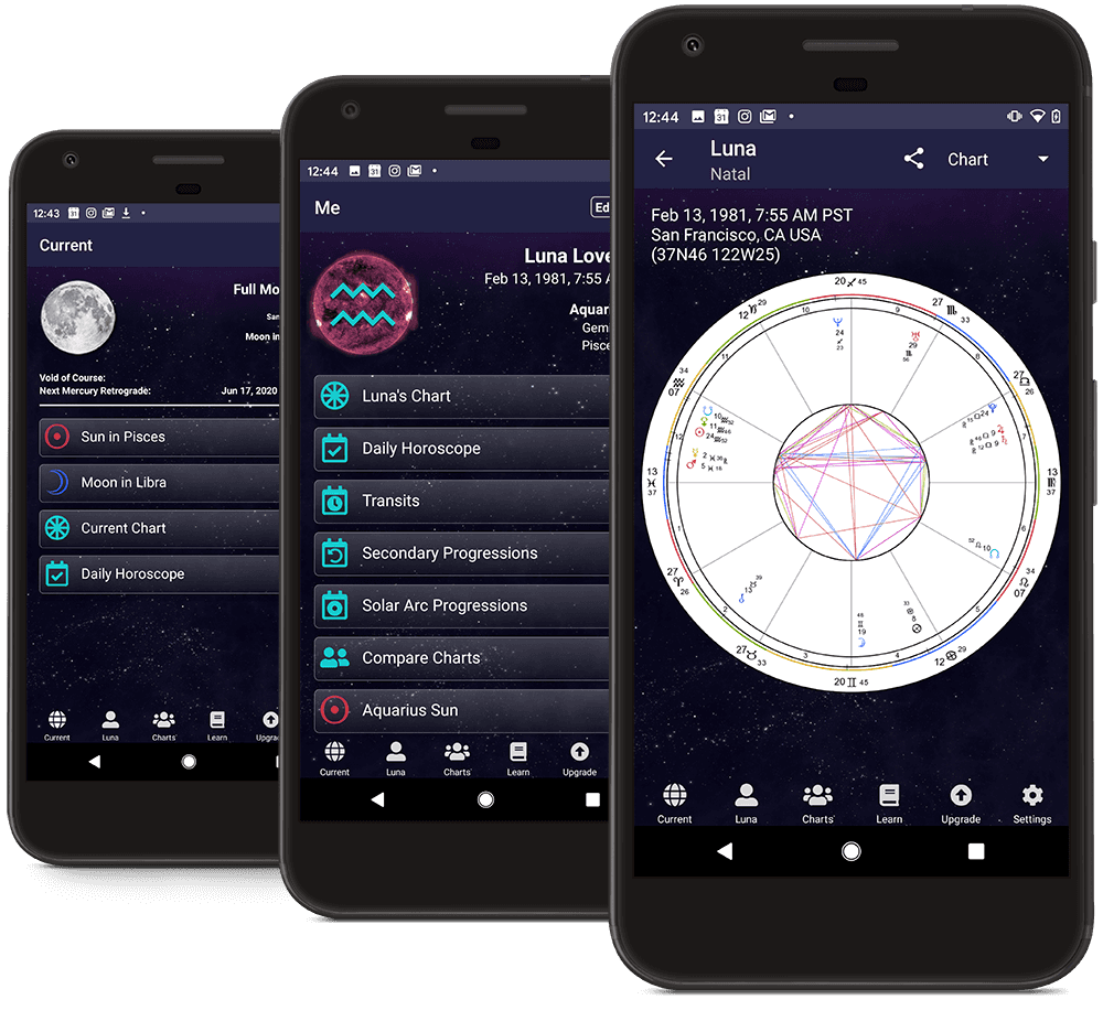
The TimePassages app redesign was prompted by both its confusing design and negative user reviews. These reviews alone justify the need for a redesign, with users expressing dissatisfaction with the unappealing design and confusing information structure. Our goal was to enhance not only the visual aspect but also the user interface to meet user expectations.
Why TimePassages?

Information and
navigation architecture
TimePassages conveys information through two main sections: astrological predictions for personal and friend horoscopes, and a learning function explaining horoscope generation. The app's content is organized into four areas for parallel navigation: the dashboard for daily horoscopes, a calendar for extended moon phase overviews, a user profile for saving birth details, and detailed views for exploring zodiac signs.

Team
Yana Streit
Vivien Bertz
TimePassages - app redesign
Redesign of a digital product: Through iterative product development, a new user experience is created. User needs define the feature set, user testing validates the concept, and design filters guide the visual and interaction design.
All projects
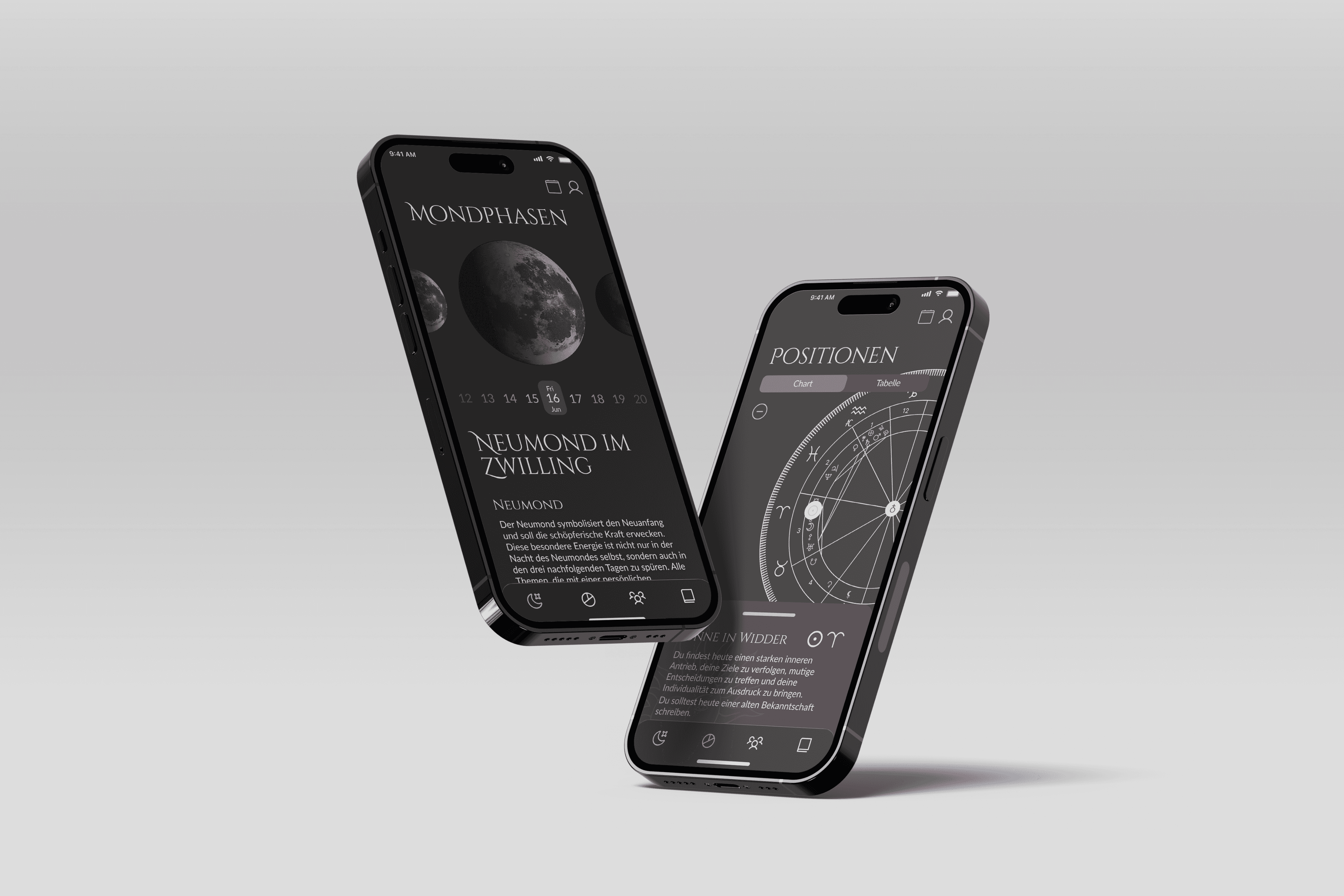
A highlight is the integration of lunar phases as a Delight feature. The interactive chart notably enhances the user experience, going beyond traditional horoscope concepts to provide an immersive platform presenting astrological data.
We've introduced a Friends feature to TimePassages, enabling users to explore astrological compatibility within their social circle. Moreover, we've enhanced the learning experience by providing interactive and detailed information on various planetary positions.
Final screens
go back to top
Want to get in touch?
That's great for both of us! :)
contact
social
2025 Tina Puseljic
Imprint
Supervision
Course
Sandra Raab
Application design
2. Semester
Skills
ux design
market research
DESIGN PROCESS
ui design


